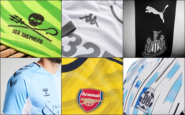
With less than two weeks until league football returns to Europe’s major leagues, the vast majority of clubs has released information about the kits that they will don during the forthcoming season. In the list below I’ve taken it upon myself to create a top 10 list, depicting the best shirts that will be seen over the course of the next 10 months. The kits featured in this list have been confined to those within the British and Irish football system, with a European and Rest of the World edition scheduled for a later date.
10 – Forest Green Rovers, Home
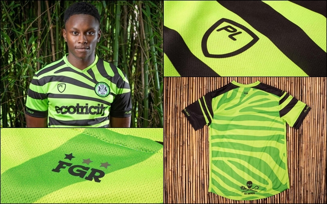
What a way to start this list; a zebra-print, bamboo-made, vegan-backed, double-eco-friendly, luminous green jersey. It’s safe to say that Forest Green Rovers have made a big impact both on and off the pitch since their promotion to the Football League in 2017. The World’s first vegan football club have carried out a litany of impressive acts in the past and the 2019/2020 kits, made in conjunction with fellow green-thinkers, PlayerLayer, are the first to push their forward-thinking thoughts on societal ethics, whilst on the pitch.
Gone are the traditional hoops and in is a vivid and bold Zebra pattern that seamlessly replaces the hoops adorning the entire kit, even making it’s way onto the shorts. An opaque version of the zebra stripes appears on the back of the shirt to comply with Football League regulations.
The design is a nod to nature, fitting into Chairman Dale Vince’s eco-friendly inhibitions, with the kit being made from 50% bamboo mix – a ploy to reduce the use of plastics. A trio of eco-friendly sponsors appear on the strip with title sponsor Ecotricity on the front once more, blending into the zebra-print design akin to that of the camouflage it takes inspiration from. Sea conservationists Sea Shephard appear on the bottom of the back of the shirt and Oatly, a plant-based milk provider will feature on the shorts.
The Green Devils also released an away kit featuring the same zebra-print design but in black and grey with lime green accents, which is infinitely more subtle. Why the club chose to forgo the possibility of replicating the zebra-print on the away shirt in black and white and thus paying homage to both their former colour scheme as well as the zebra’s palette is a mystery as that kit would have joined the home kit on this list. The club are set to release a third kit before the new season kicks off in collaboration with Sea Shephard.
9 – Leeds United, Home
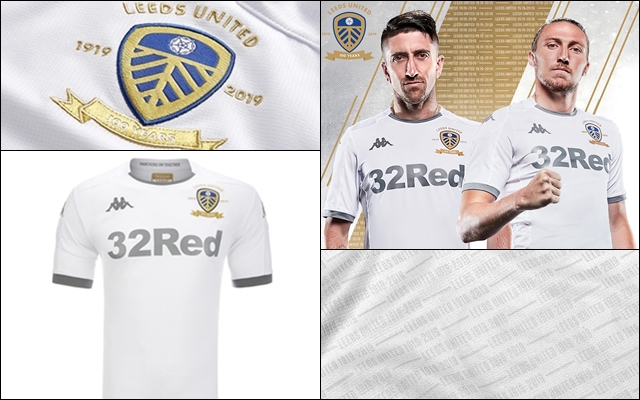
Centenary shirt and crest? Check. Slick traditional Kappa design? Check. Convincing your sponsors to change their primary colours to honour the anniversary design? Check.
Just look at it. It’s a thing of beauty. I’m a sucker for an anniversary kit and both Leeds and Kappa have smashed it out of the park with this one. Even my negative view towards kits with betting sponsors dissipates into the background here; partly due to the fact that the 32Red logo is simple enough that I could genuinely recreate it in the edit mode of Pro Evolution Soccer 5, and believe me I spent a lot of time in my youth editing in that game, and secondly, because they put Leeds’ desire to create a truly beautiful kit to mark the occasion as priority. Secondary sponsor, Clipper also play ball with the reshuffle, on the back of the shirt.
The kit’s design is simple and clean, the blue and yellow accents of previous kits are out and in comes platinum. Small platinum details on the collar and cuffs are accentuated by Kappa, 32Red and Clipper joining suit. A special crest has been commissioned for the season detailing the club’s 100-year existence with dashes of gold. However, the classiest touch has to be the extremely subtle ‘Leeds United 1919-2019‘ text graphic that covers the entirety of the reverse of the shirt and can only be seen clearly in close proximity.
Reaction to the release has been extraordinary with Leeds selling a record number of shirts. In the first 12 days since launch they’ve managed to equal the amount of shirts sold in the first 12 WEEKS for last year’s home shirt. Even the home Goalkeeper shirt has experienced enormous popularity, selling over five times as many units as any previous ‘keeper jersey.
8 – Tottenham Hotspur, Away
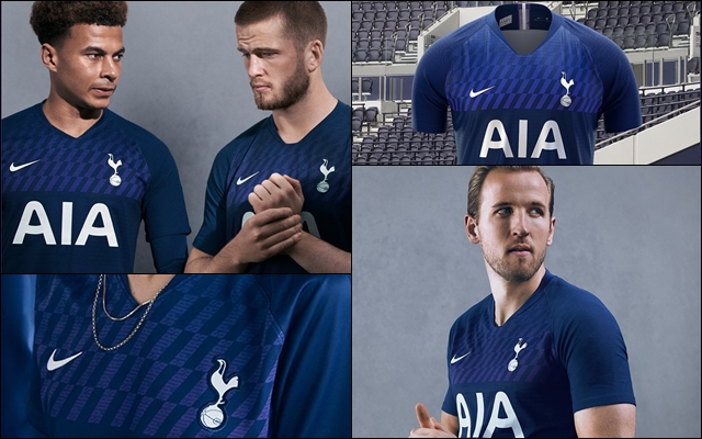
Forgive some small elements of bias with this one, but I absolutely love the new Spurs away kit for the 2019/2020 season. Made by American powerhouse Nike, the shirt is deep navy with a purple diagonal text graphic across the chest that reads ‘Spurs‘ upon closer inspection. The graphic is repeated on the tail of the reverse of the shirt.
The new shirt evokes elements of years gone by with similarities to three Spurs kits of the past; the chest design similar to Hummel’s 1986 effort, the ‘Spurs‘ text graphic resembling the 1991-1994 third shirt and a navy-leading-purple number last worn by the likes of Jurgen Klinsmann in 1994, the latter duo being produced by Umbro.
The classy away number has also drawn comment for the shaping of the purple text graphic with Spurs fans seeing a similarity in the design to the panelling that clads the club’s new 62,062 seater, Tottenham Hotspur stadium.
7 – Cambridge United, Away
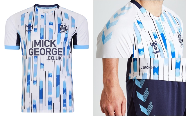
Everything about this kit screams superb. A complimentary colour palette, a vote to let the fans have their say and a retro-inspired bespoke Hummel humdinger.
A cacophony of colour, Cambridge United’s new away shirt features a white base with a remarkable configuration of blues. Navy and sky blue join the standard shade in this epic throwback to the kit worn by the U’s on the road during the 1993/1994 season. The kit features a bold semi-striped design, with non-symmetrical patterns and a splatter approach to where each differing shade of blue is placed.
Hummel’s trademark chevrons are present across the shoulders of the shirt, on the shorts and socks, whilst the kit is finished off with a tonal crest that matches the kit’s colours.
6 – Torquay United, Home, Away & Third
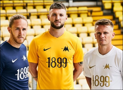
To pick just one of these kits would have been an injustice to the two I’d be leaving behind. Made by Nike, in partnership with Torquay United’s affiliation with ProDirectSoccer, the three identical designs look stunning and are the perfect representation for the club as they mark their 120th anniversary.
Adopting the ever-popular approach of not having a shirt sponsor, the yellow home, white away and navy third kits have a simple, but meaningul ‘1899‘, referencing the club’s year of formation, emblazoned across the front of the shirt in an aesthetically pleasing typeface harking back to the font used on the 1967/1968 kits. The anniversary is further referenced on the crest, with a minimalistic variation of the traditional badge being used alongside text, also commemorating the occasion.
With black accents on the home, gold on the away and white on the third, the trio of jerseys will be worn in the fifth-tier of English football as Torquay look to gain back-to-back promotions and enter the Football League once more from the National League.
5 – Crystal Palace, Home & Away
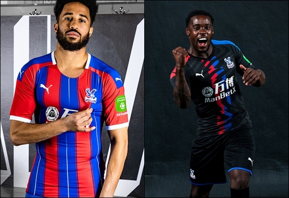
After a decade in the wilderness, white has returned as Crystal Palace’s tertiary colour teaming up with club’s traditional shades of red and blue in some style. After aligning themselves with Germany’s Puma for the forthcoming season, the Eagles and the big cat brand have proven they can co-exist, going against the stereotypes of wildlife etiquette.
With a white collar, trim and pin-stripe complimenting the Selhurst Park club’s much-loved red and blue stripes, even the club’s somewhat gaudy MaxBetX shirt sponsor blends well into the design as the club prepares for their seventh consecutive season in the Premier League, a club record stint.
The club’s away shirt also maintains the slick, impressive work from Puma with a stylish black shirt that features the club’s red and blue colour scheme occupying a shoulder panel each and a dual-stripe down the centre of the shirt. The simplicity of the shirt is broken up by a dark grey jagged pattern that meshes well with the black and filters through the central stripe.
4 – Coventry City, Home & Away
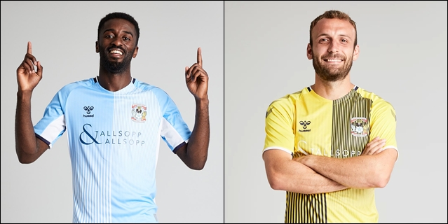
Retro kits will take stage from here on out, starting with the previously applauded Hummel. back again. Teaming up with Coventry City, Hummel have dropped two sensational kits for the Sky Blues’ League One campaign.
The now homeless Midlands side will relocate for the 2019/2020 season, playing their home fixtures at Birmingham City’s St. Andrew’s stadium, but they will do so in jaw-dropping kits. The home kit features a subtled half-and-half design, with each half featuring identical designs in opposite directions. The predominantly sky blue kit transcends into a white pin-stripe gradient and features navy Hummel chevrons accross the shoulders. The away kit follows the same suit, but in yellow and navy with a sprinkling of white on the collar and cuffs.
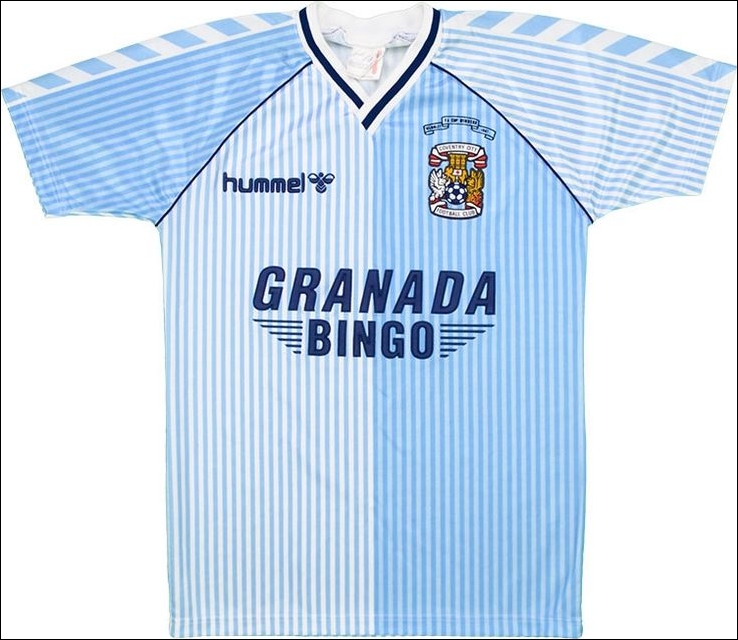
Both kits pay homage to the 1980s when Hummel provided kits for the then top-flight club and the results of their labour prove that the Danish outfitter are well and truly back to their best in terms of kit design.
3 – Hull City, Home
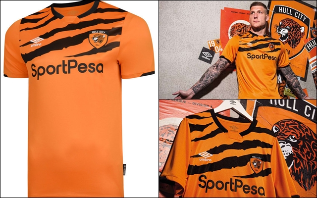
Retro-themed and a nod to your own nickname? Hull City, you’re spoiling us.
Gone are the amber and black striped shirts of the past as Umbro’s 2019/2020 effort displays a unique, bespoke ‘tiger skin‘ accross the chest and shoulders for the Championship season. A new crest joins the old shirt design, with the synonymous tiger, now housed within a rounded-shield with text that reads ‘Hull City‘ and ‘1904‘, the club’s year of foundation
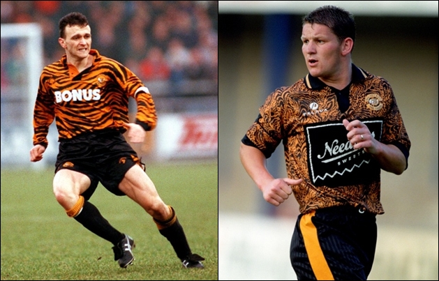
The design is an admitted nod to the home kits worn between 1992 and 1995 which featured similar designs accross the entirety of the shirt, but in much less subtle fashion. The previous tiger-inspired kits have drawn both criticism and acclaim from football fans and have become somewhat of a cult classic, even beyond the Humberside club’s fan-base.
2 – Newcastle United, Home
There’s little doubt that Newcastle United’s actions throughout the off-season have left an already maligned fan-base, gathering their pitchforks in anticipation of sending of a message to Mike Ashley.
With Rafael Benitez heading to China and loan-star Salomon Rondon joining him, as the Magpies bypassed his £16.5 million release clause to sign Hoffenheim’s Joelinton for more than double that, it’s been a bad summer for the Geordie faithful, but Puma’s collaboration with will add the most dainty of silver linings to proceedings.
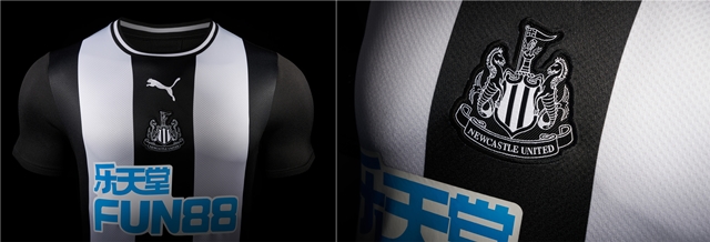
The 2019/2020 home shirt is absolutely stunning and not even the light blue Fun88 betting sponsor can taint the kit’s looks. The shirt features just three stripes, that continue onto the back of the shirt, avoiding the saddening trend of hooped and striped shirts having a block-colour reverse.
A round-neck collar adds to the classic feel and a monochromatic version of the North-East club’s crest is placed in the centre of the shirt. The kit is inspired by the kits worn 50 years ago as Newcastle lifted the 1969 Inter-Cities Fairs Cup.
1 – Arsenal, Home & Away
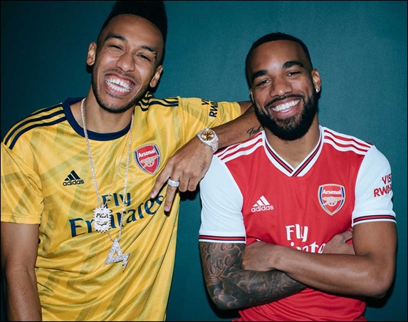
It was probably one of the first sets of kits that entered your mind when you saw the name of this list, the best kits this season are Arsenal’s home and away shirts.
With both shirts taking inspiration from Arsenal shirts of the early-1990s, the home features Arsenal’s traditional red with white sleeves, and a stylish overlapping sports collar. The shirt is complimented by minor touches of black on the collar and on the sleeve cuffs bearing resemblance to the kits worn between 1986 and 1990.
The away kit pays tribute to the famous ‘bruised banana’ kit worn from 1991 and 1993 with a yellow base and navy touches, a design Arsenal fans have longed for a return and their return to Adidas have delivered. Whilst the ‘bruised banana’ graphic isn’t as prominent as the kit from the early 90s, the modern day take on it brings a subtle yet quality visual.
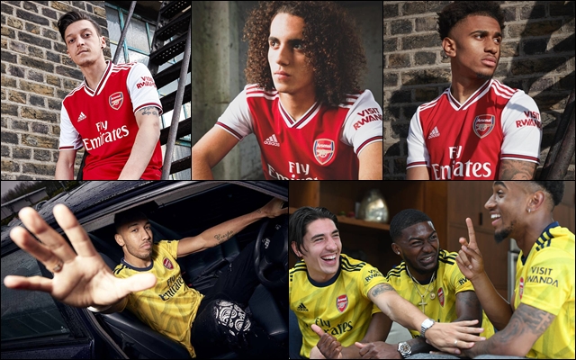
The jerseys are a welcome addition to the Arsenal faithful after fans had made their voices clear on their view about former technical partner Puma’s designs.
